How to create a Line Chart
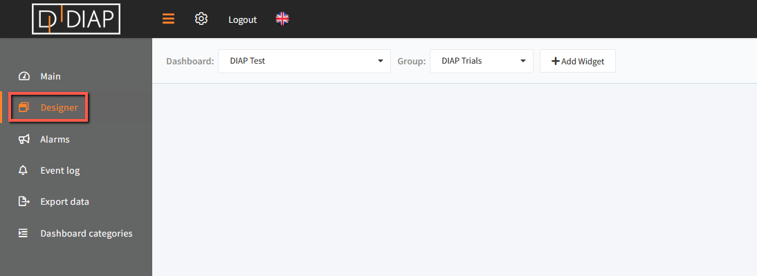
Go to the Real-time application and select Designer in the main menu.
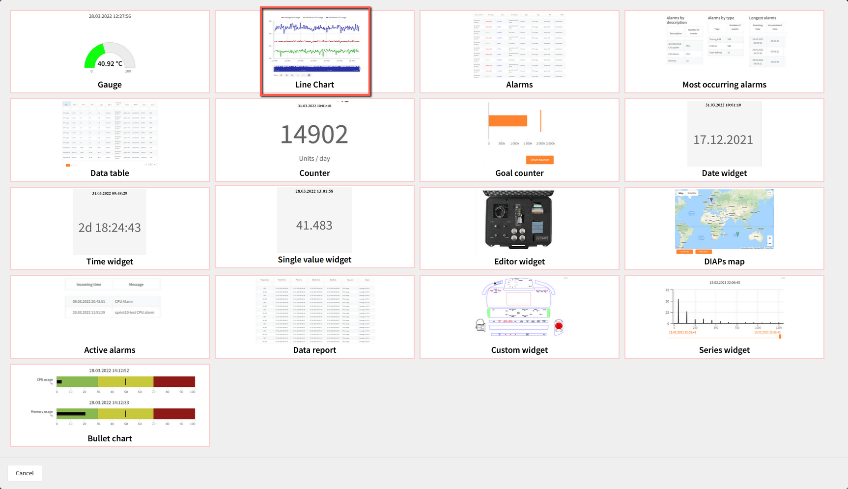
Click "+ Add Widget" and a popup window will open.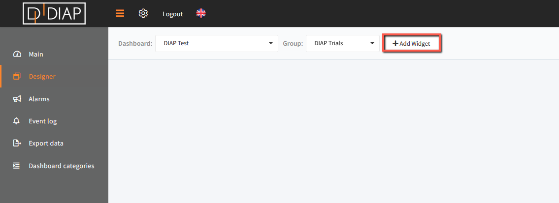 In the popup window you have to choose "Line Chart"
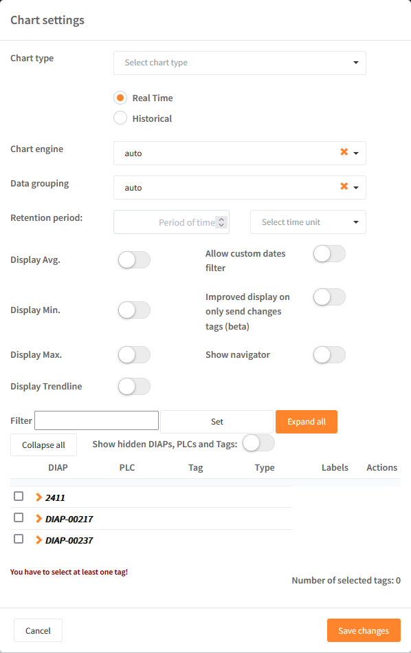
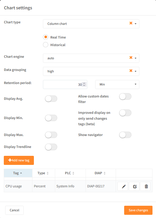
Field explanation:
- Chart type: Choose the type of chart that you wish to see. You have the following options:
- Line chart (linear interpolation)
- Spline chart (spline cubic interpolation)
- Area chart (linear interpolation)
- Area spline chart (spline cubic interpolation)
- Column chart
- Real Time / Historical
- Choose Real Time to see data from the current time and a defined period back in time.
- Choose Historical to define a period of time.
- Chart Engine / Data grouping
- It is now possible to define which Chart engine should be used to draw the graph
- With "Data grouping" it is possible to group the data
- Retention period: The field will be displayed if you have selected Real Time above. Define the time period that you wish to use, e.g. 30 minutes back in time.
- Historical: The field is used if you have selected Historical above. Here, you can enter a specific time period (date and time).
- Display Avg.: When activated, you will see an average line on the graph.
- Display Min.: When activated, you will see a line displaying the lowest value on the graph.
- Display Max.: When activated, you will see line displaying the highest value on the graph.
- Display Trendline: When activated, then the chart will display a trendline in the graph, which takes into account the data within the graph and the time period you are looking into.
- Allow custom dates filter: Enabling this will make it possible for the operators to set a custom data on the page "Main".
- Improved display on only send changes tags (beta): is useful when using "Only send changes" tags, where the graph will show data, even though there are no new data from the PLC or sensor.
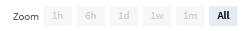
- Show navigator: When activated, then a quick zoom possibility will be shown in the graph. This will make it quick and easy to zoom to 1 hour, 6 hours, 1 day, 1 week, 1 month.
Data has to be selected to be added to be displayed in the graph. You can display multiple values in the same graph. Data selection can be found in the lower part of the popup window.
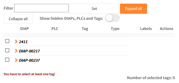
Field explanation
- Selection of data - expand the DIAP and select tag:
- DIAP: Select the DIAP that you wish to show data from.
- PLC: Choose PLC or sensor.
- Tag: Select the tag that you would like to visualize data from.
Remember to save changes.
When you click "Save changes", the window will close and the chart will be displayed.
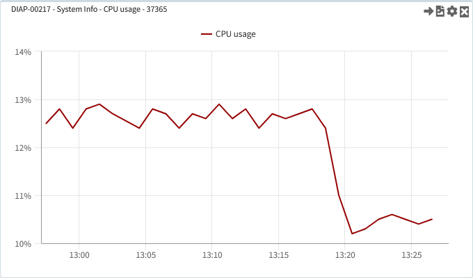
An example of setting up a Line Graph can be seen below: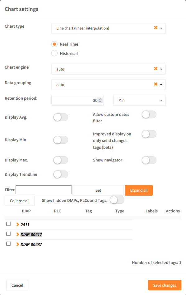
Once "Save" has been pressed then a widget will be shown in the dashboard.
Manual Y-axis and setting this up
Once a tag has been chosen, then it is possible to set a manual Y-axis value by selecting the pencil for the tag: 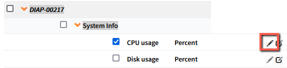
Activate the toggle if you want Y-axis to be manual. If you choose manual Y-axis, you need to enter the following information:
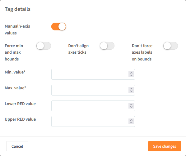
- Min. value: Defines the minimum value on the Y-axis.
- Max. value: Defines the maximum value on the Y-axis.
- Lower RED value: Defines a lower red area on the graph.
- Upper RED value: Defines an upper red area on the graph.
Repeat the process if you wish to visualize multiple tags and sensors in the same chart with multiple manual Y-axis.