Guide
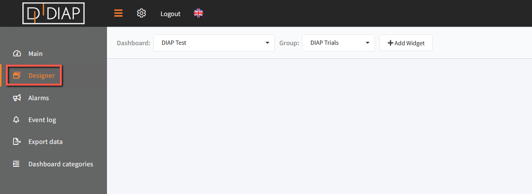
Go to the Real-time application and select Designer in the main menu.
Click "+ Add Widget" and a popup window will open.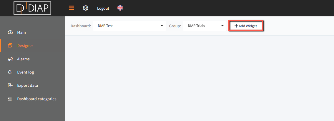 In the popup window you have to choose "Data report"
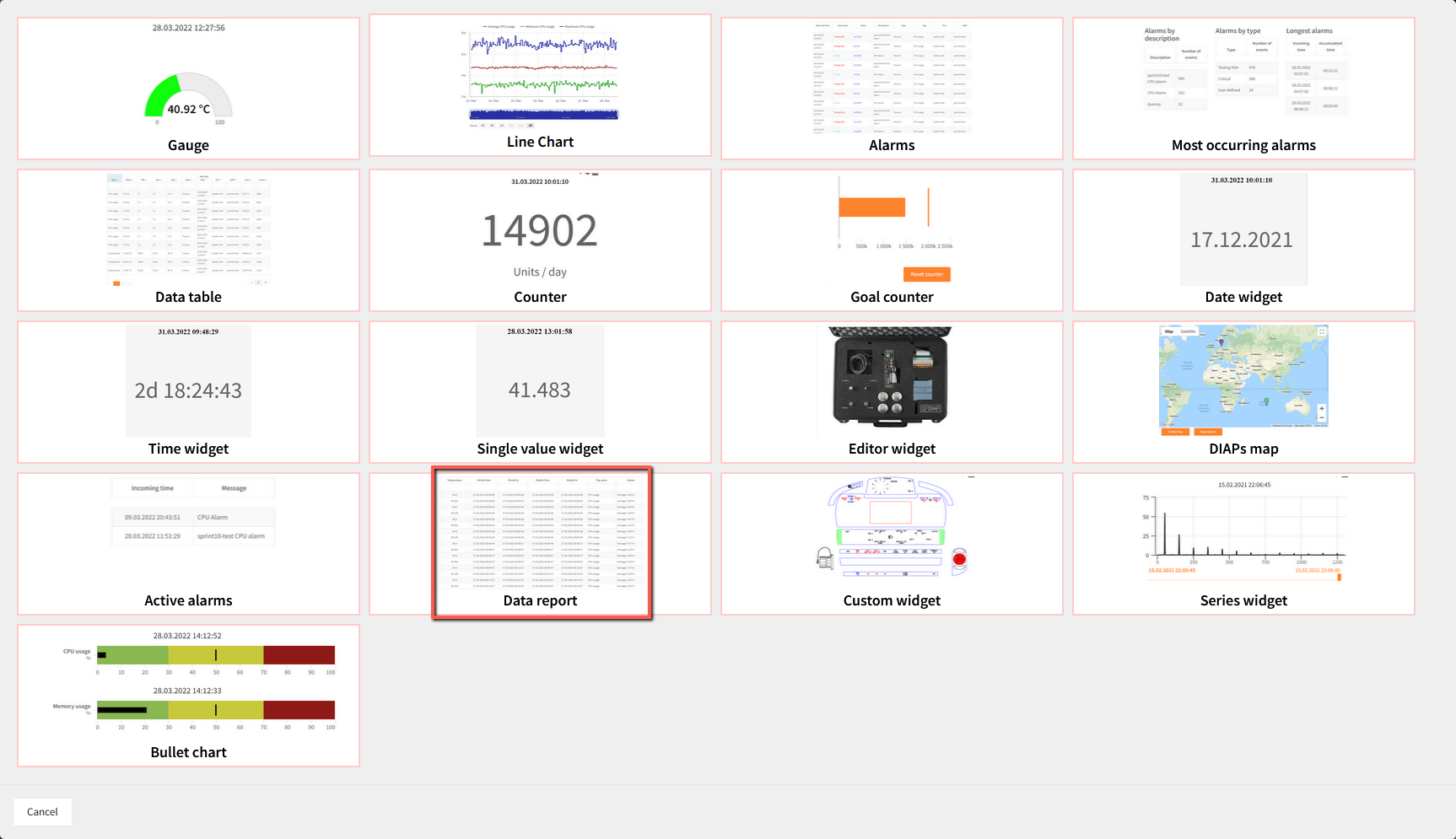
You will now see a pop-up where you need to define the data that you wish the data report to display.
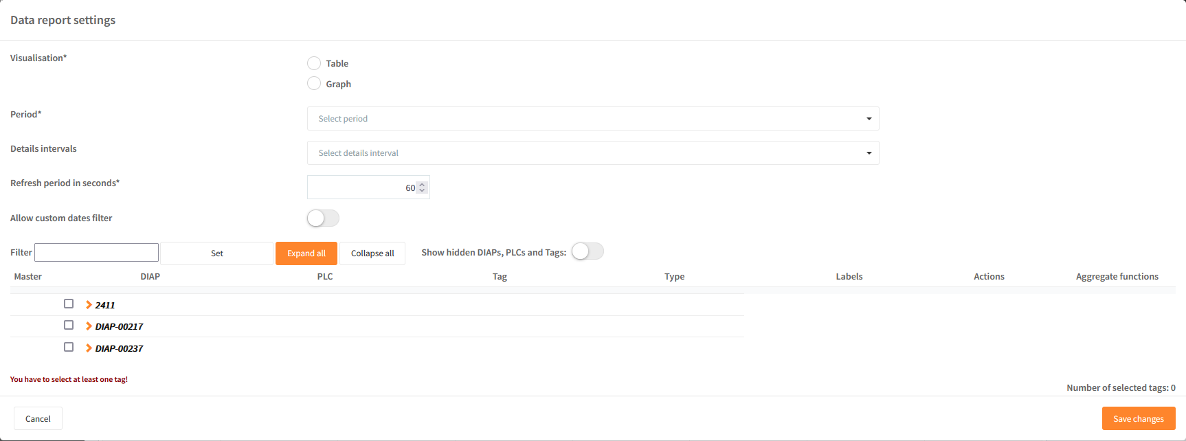
Field explanation:
- Visualisation: Data can be visualized as a table or graph.
- Period: This determines which time period you wish to see data from.
- Details intervals: How shall the data be grouped. Once for showing the data once according to the master tag, hourly, daily and weekly.
- Refresh period in seconds: How often should the widget refresh in the dashboard.
- Allow custom dates filter: If enabled then an operator will be able to select their own period in the data visualisation
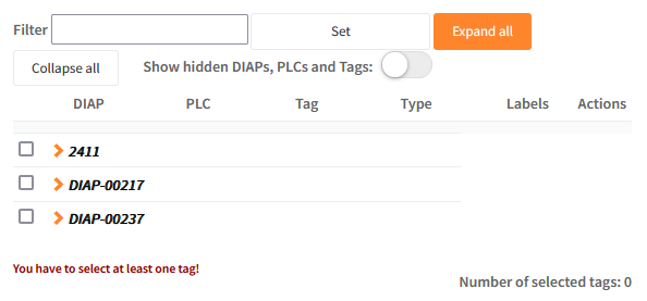
Data has to be selected to be added to be displayed in the graph. You can display multiple values in the same graph. Data selection can be found in the lower part of the popup window.
Field explanation
- Selection of data - expand the DIAP and select tag:
- DIAP: Select the DIAP that you wish to show data from.
- PLC: Choose PLC or sensor.
- Tag: Select the tag that you would like to visualize data from.
Once a tag has been chosen, then it is possible to use actions and aggregate functions:
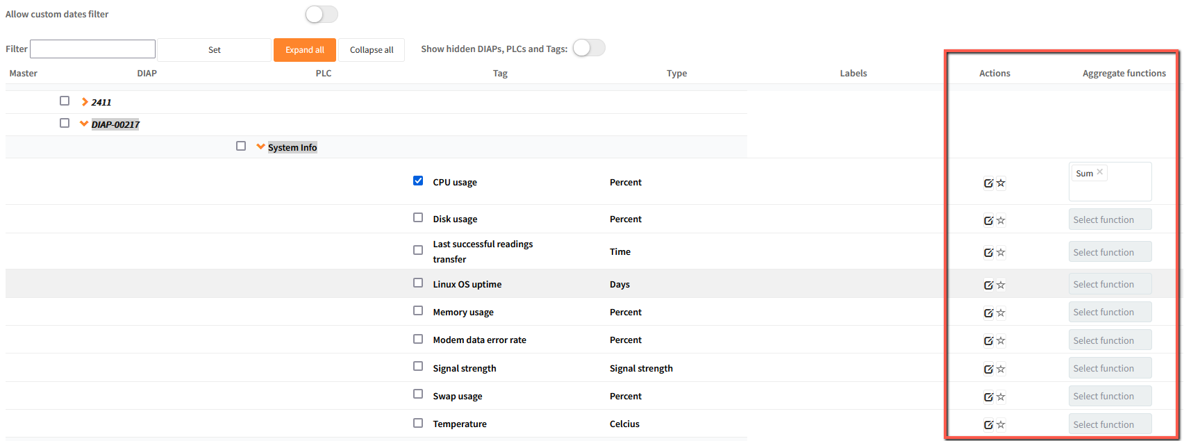
Use the icon  in order to select which tag has to be the master tag (the can be pressed again to deselect the master tag). It is possible to use the widget without a master tag and just be based on the interval chosen.
Aggregate functions will enable you to select the following functions: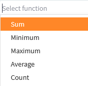
Once the wanted functions has been chosen, then press "Save changes" and the pop-up will close.
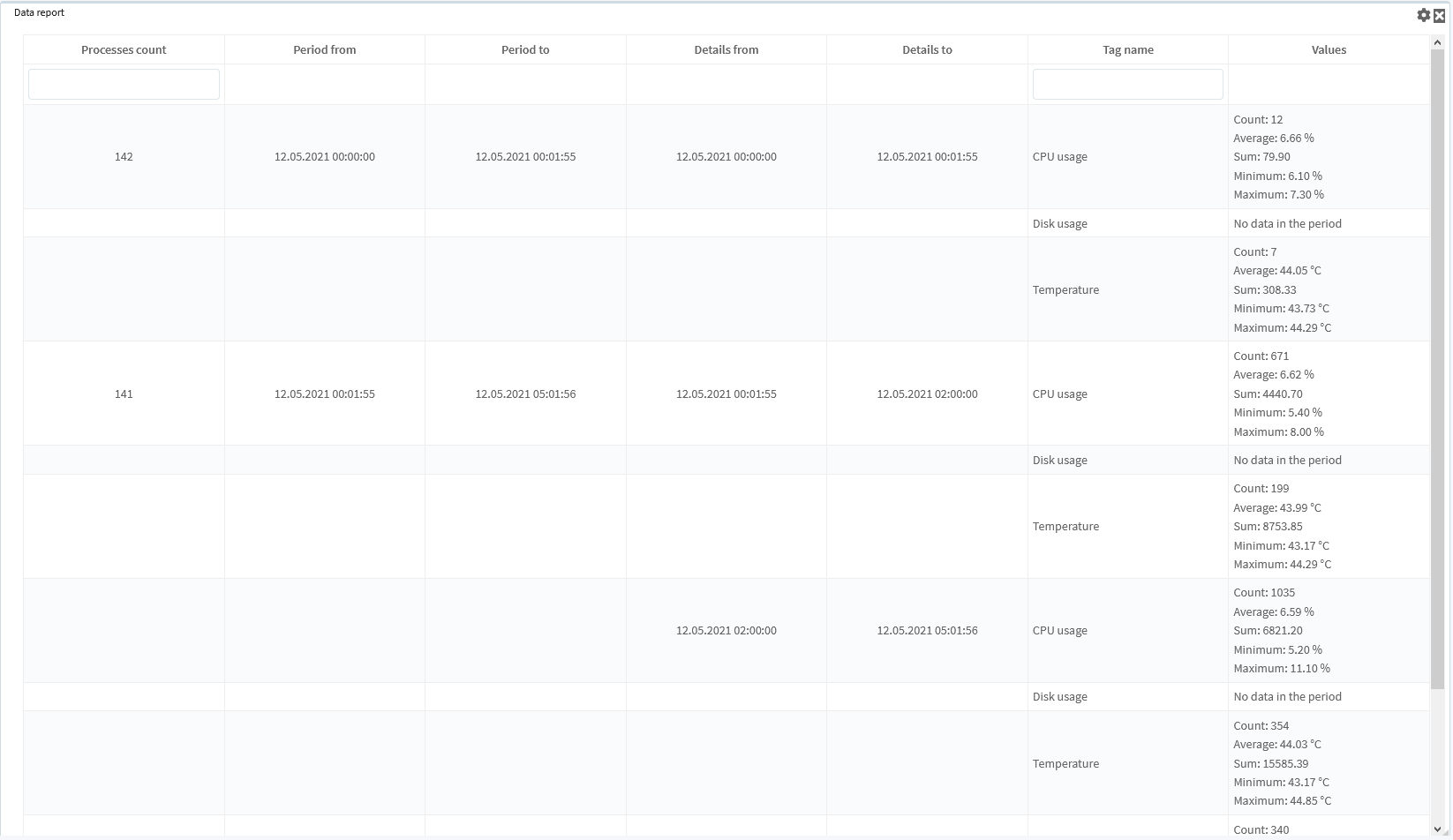
Now you will see the data according to the master tag chosen - an example can be shown underneath this: